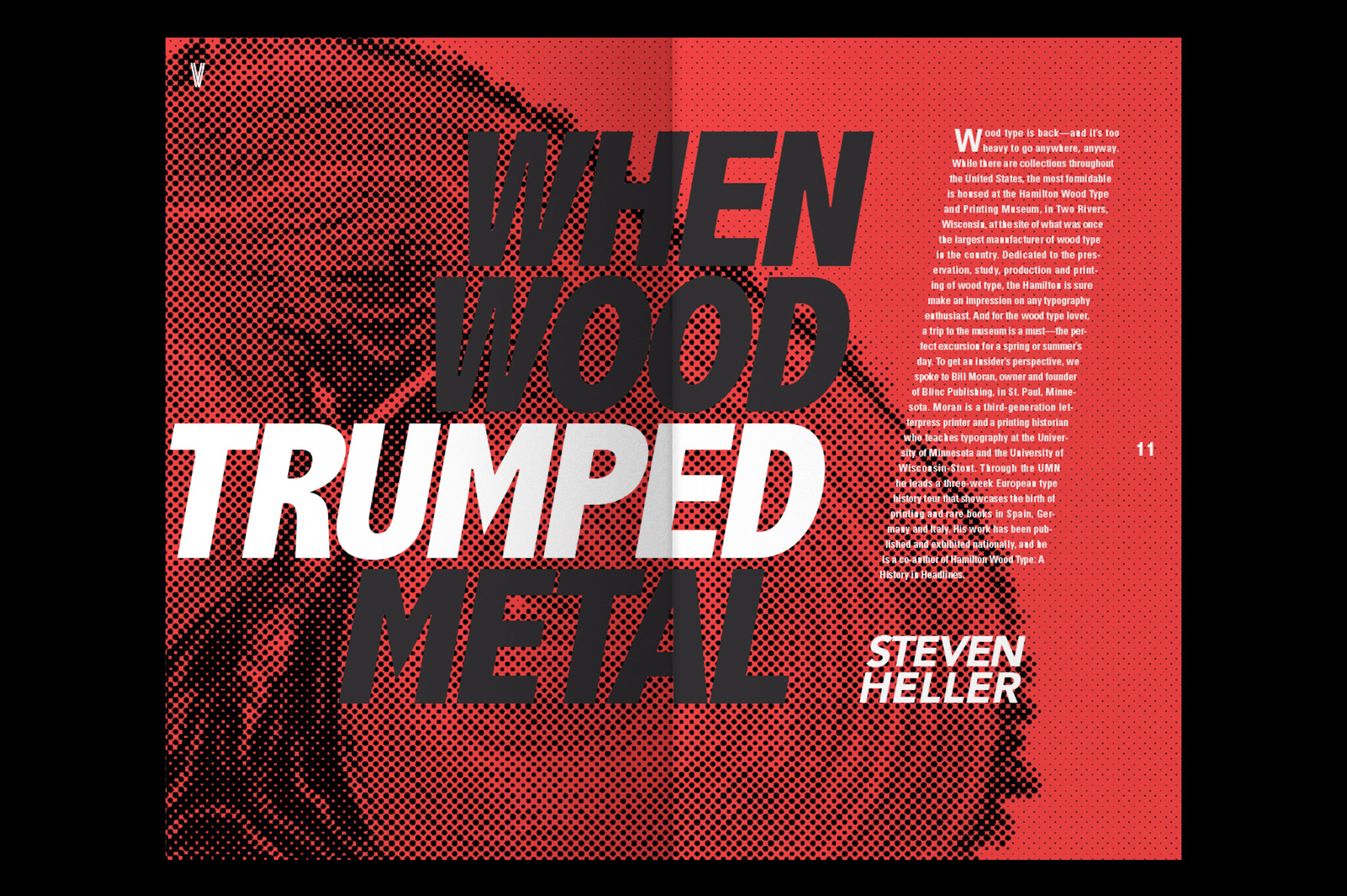
The Winter 2017 Issue of Voice includes articles on color, woodcut type, and Swiss designer Armin Hofmann.
![](https://cdn.myportfolio.com/9e3f80405a3a53a0c852a4c17b23e9a0/09715c9d-1828-47d4-9a1f-43f633fae05c_rw_1920.jpg?h=27227a3056681e71a48971b02311e799)
![](https://cdn.myportfolio.com/9e3f80405a3a53a0c852a4c17b23e9a0/9adaed47-1348-4677-85b8-595ba1e74446_rw_1920.jpg?h=f0326e400c4443c63474cb784ab3f641)
For this design, I chose to take a risk and try using slanted columns in the magazine's layout. Both standard vertical columns and slanted columns are used to mimic the diagonal lines seen in Voice Magazine's logo.
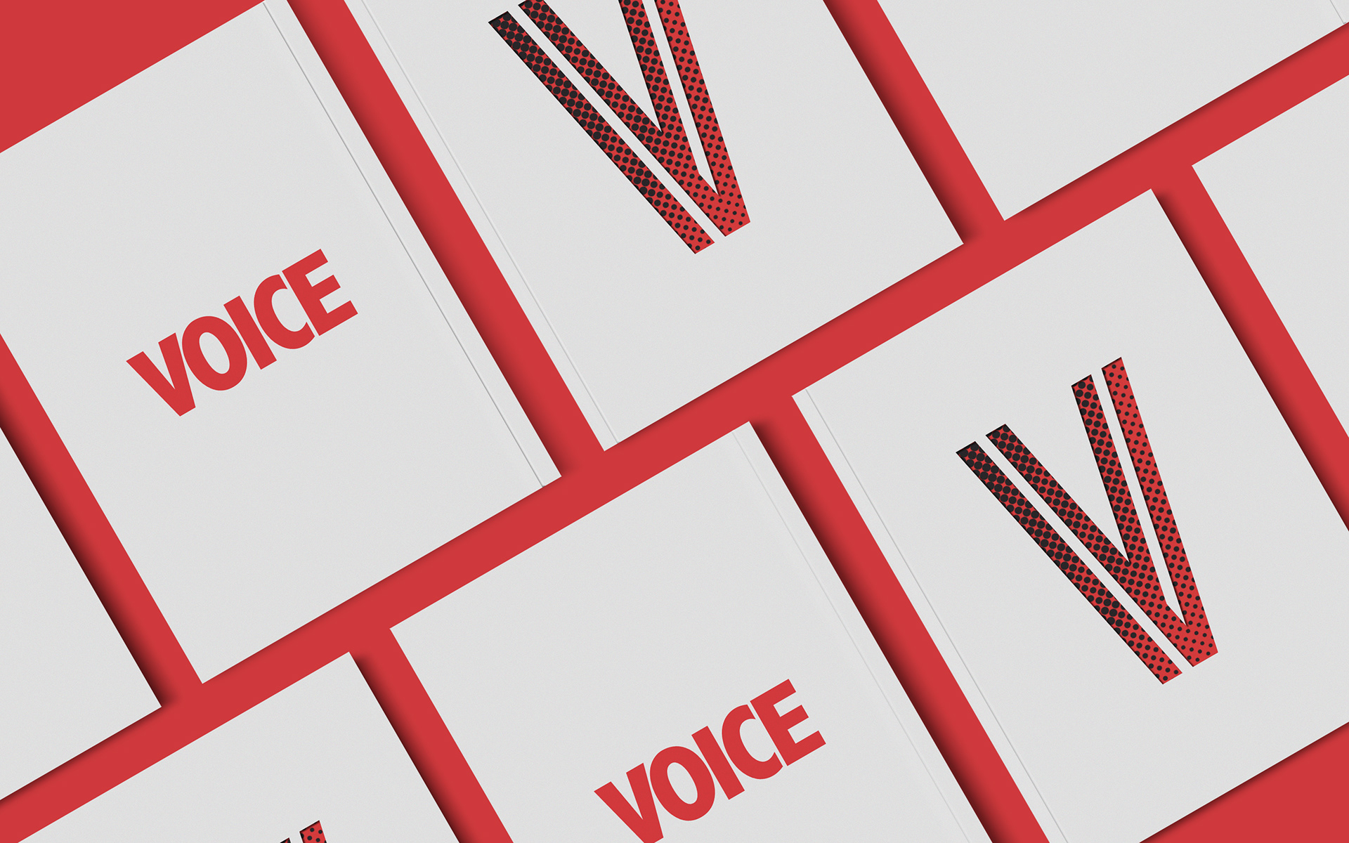
I opted for a simplified color palette, using only white, black, and reds throughout each spread.
![](https://cdn.myportfolio.com/9e3f80405a3a53a0c852a4c17b23e9a0/6ea86207-5973-4b29-b045-2a9d7937f47d_rw_1920.jpg?h=aa0d4b9df5f4e8273cab951cacd840b2)
![](https://cdn.myportfolio.com/9e3f80405a3a53a0c852a4c17b23e9a0/5d80ab25-2704-4bb7-a4ae-891abe584bdb_rw_1920.jpg?h=1d87afa9485eb089a4b66eeee0be1fd2)
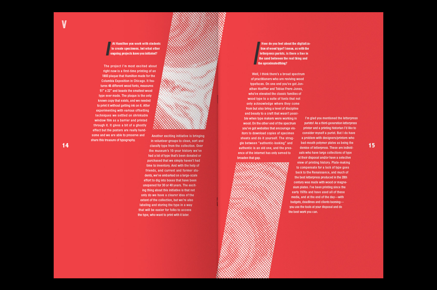
Halftone patterns are used on images to provide a stylistic twist and reinforce cohesion throughout the entire magazine. Additionally, this pays homage to the article on woodcut type to add texture to the images.
![](https://cdn.myportfolio.com/9e3f80405a3a53a0c852a4c17b23e9a0/84fe65b4-4e77-41a9-8963-533393d6d0b0_rw_1920.jpg?h=6823726acbe7756a554b24aa7799b084)