Featured in the 2019 American University Design Show
Delirium is a concept for the annual American University Design Show, held by the school's design club. This concept was proposed to the design club to be used for the 2019 show.
POSTERS
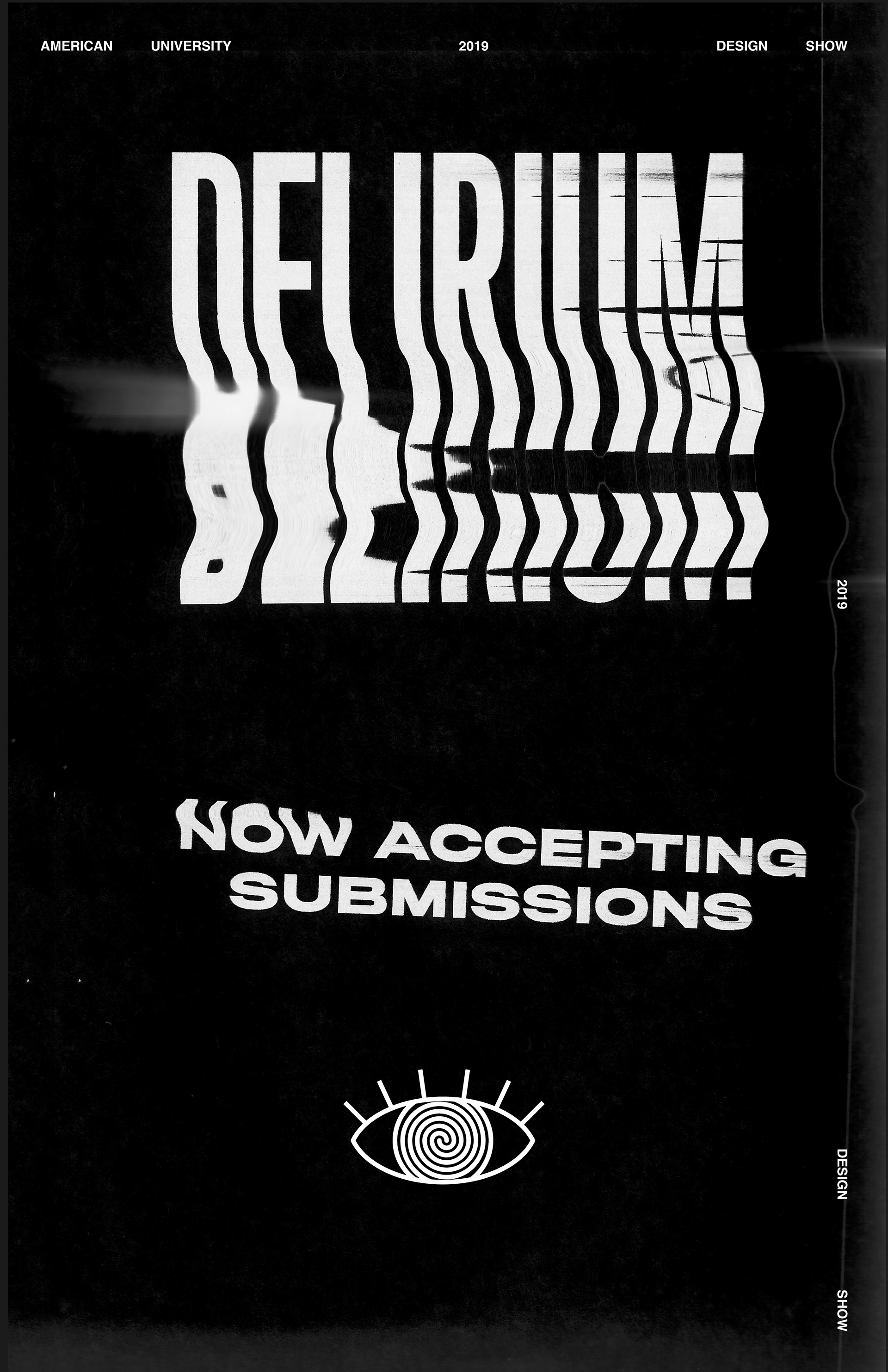
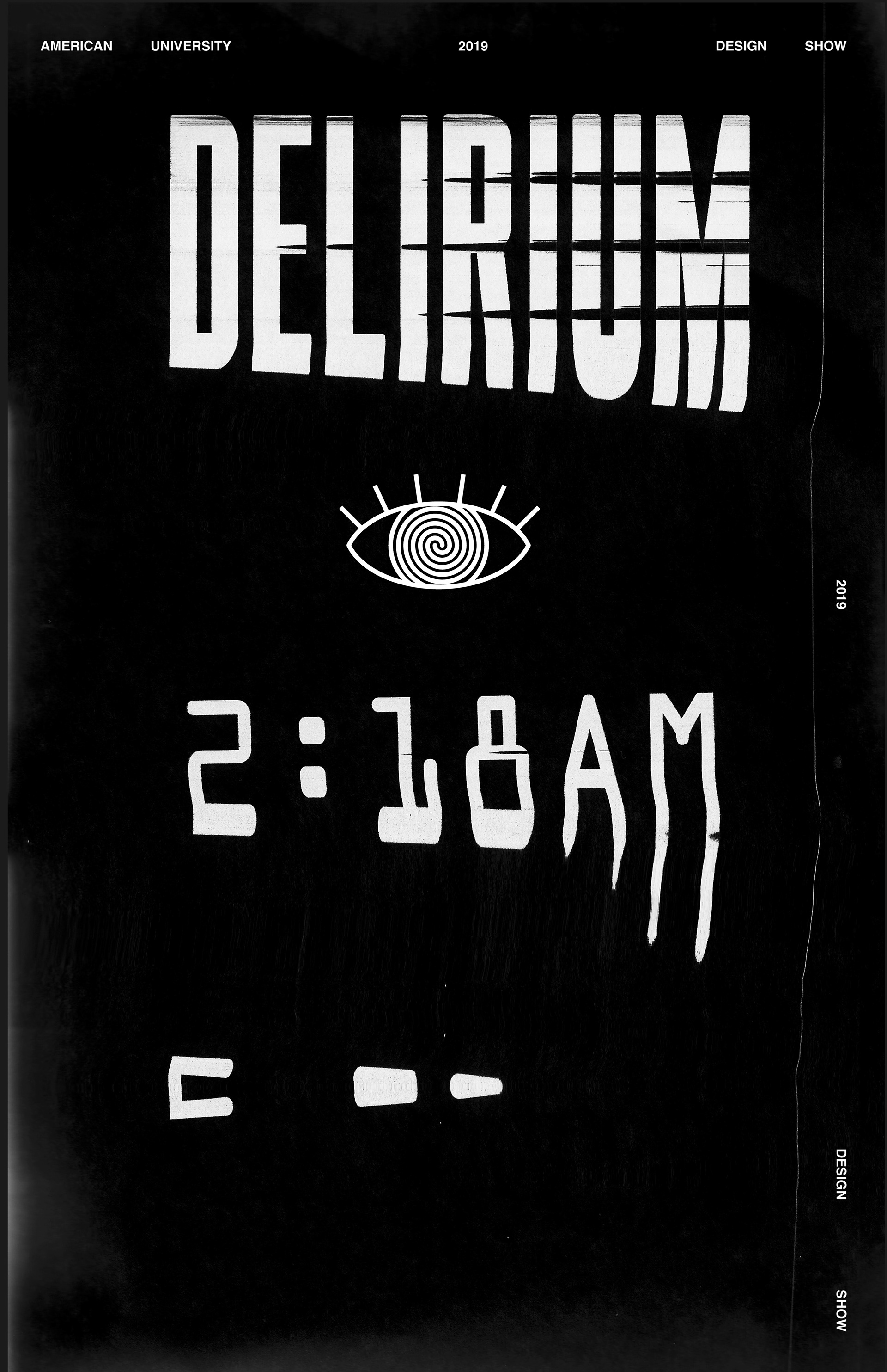
Taking inspiration from the mishaps that occur while working on projects late into the night, Delirium's posters are directly influenced by scanning errors, low ink on printers, and the delirious state designers are faced with when staying up late.
Name TAGS
Since the design show includes many designers from American University's program, it's important that designers have name tags to easier connect visitors with the work they have featured in the show.
WEBSITE
The website created for the design show every year is the primary source of information about the featured designers and their work. My concept is no different in this way, but follows the strong motifs seen on other components of the show. Glitch effects would be applied to designers images that would be animated on a loop to add a dynamic element to the website. As users hover over the image this effect would disappear and allow the user to learn more about the designers.
SOCIAL MEDIA POSTS
The American University Design Club has a current social media presence on Instagram which is followed by current students and alumni alike. These social media post concepts allow the design club to inform their audience of the show taking place, and to invite students to submit their work.
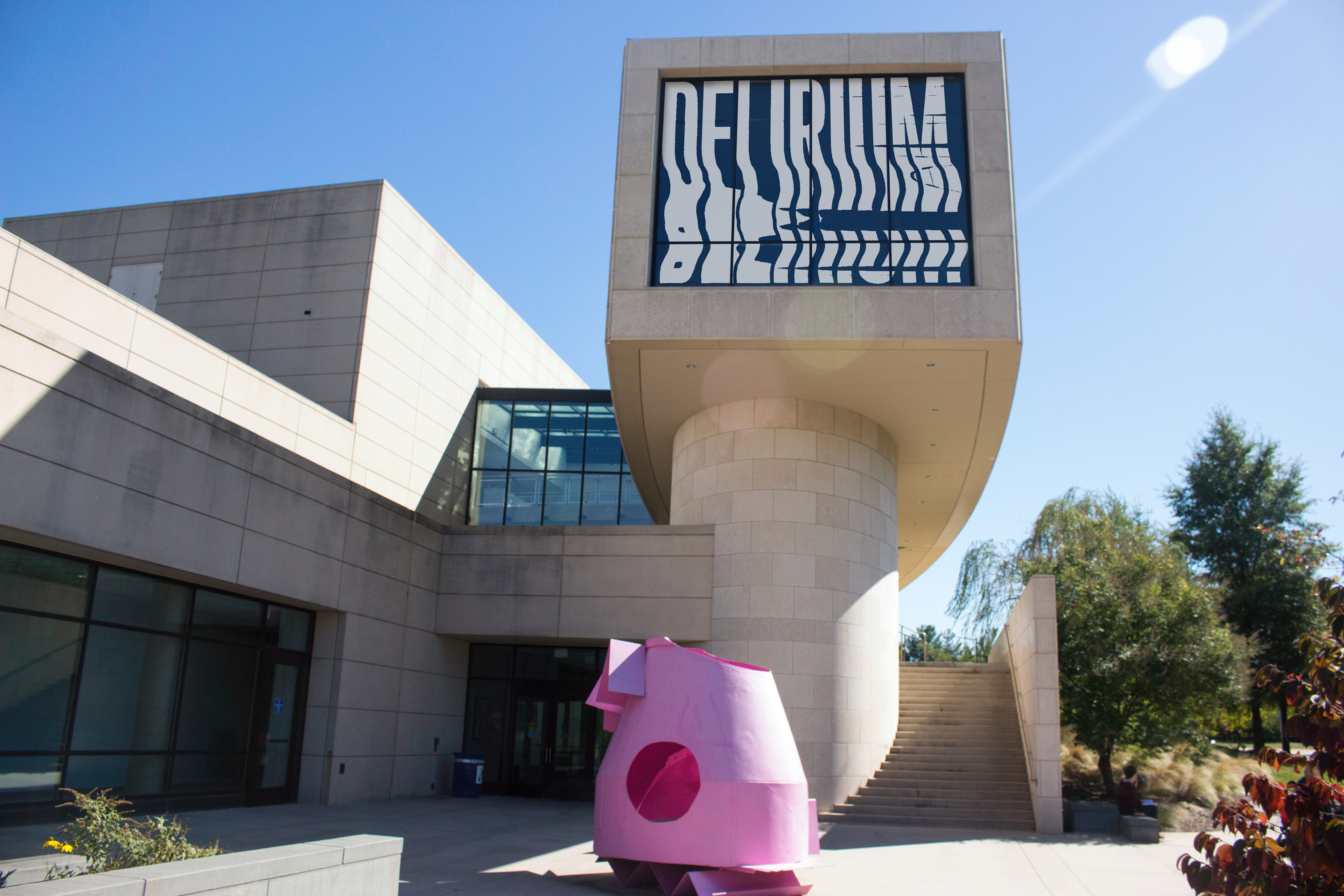
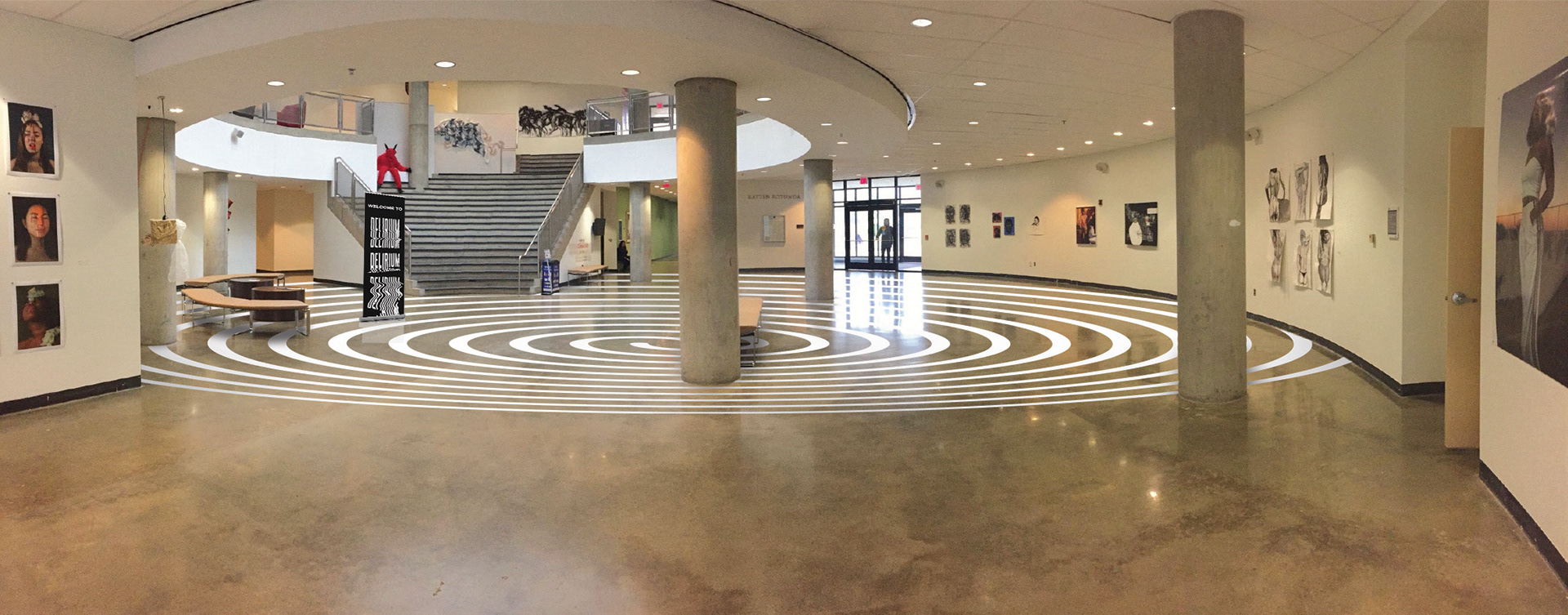
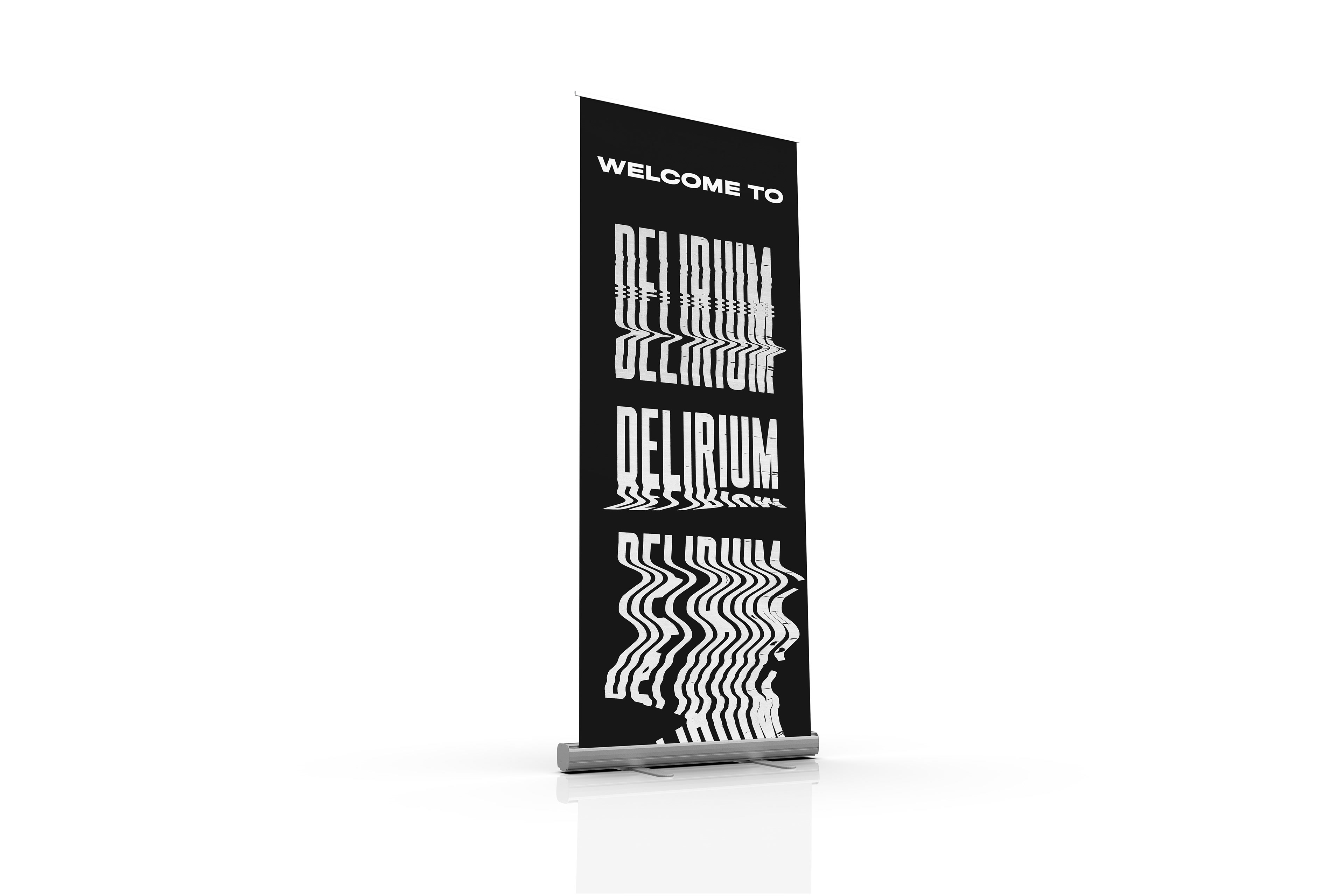
EXHIBITION & SIGNAGE
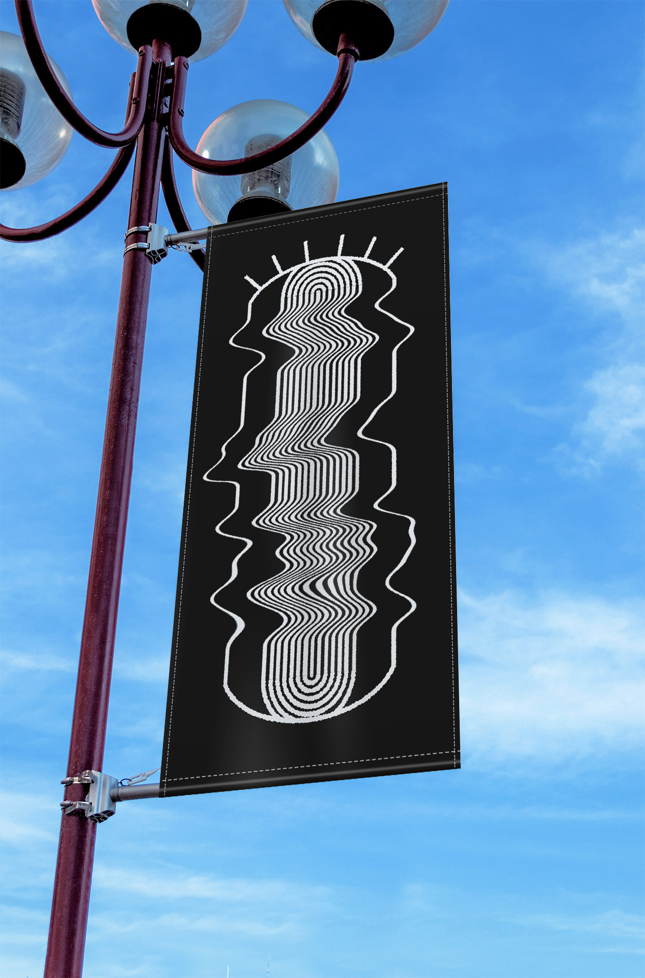
I felt that it was important to additionally design signage that could be implemented throughout American University's campus to invite students and faculty who might not otherwise know about the show taking place. These examples of signage and the exhibition itself are ways in which this could be achieved.
STATIONERY
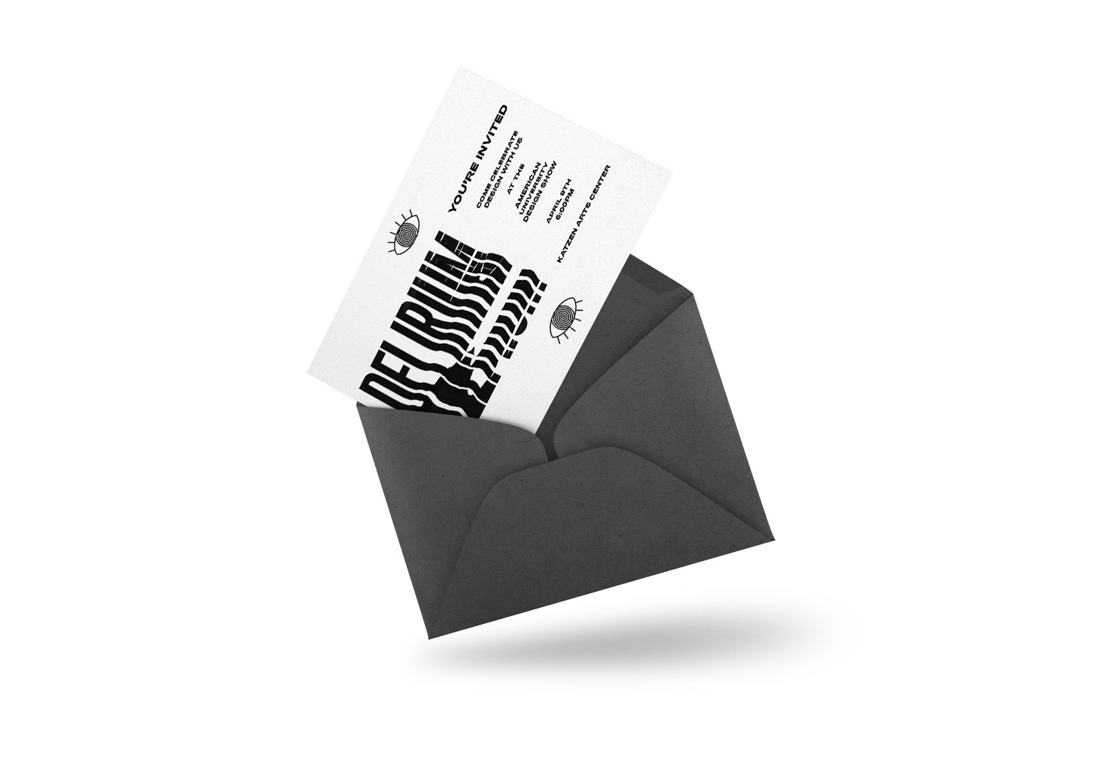
American University's design show is attended not only by the designers who's work is featured, but additionally by designers from DC's design community. These designers are reached out to in various ways and I wanted to conceptualize a mailed invitation to be used for this purpose.
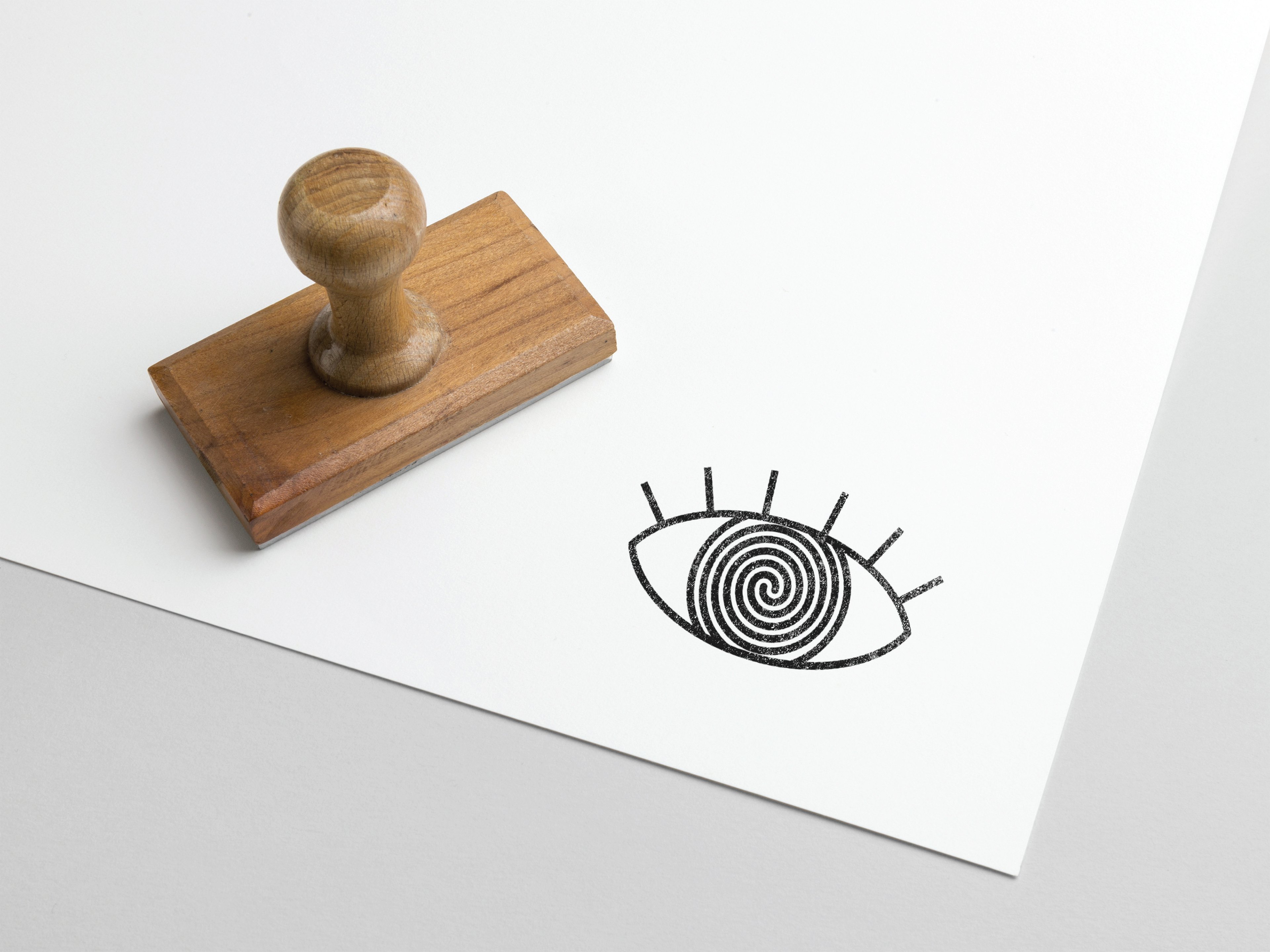
An earlier iteration of the show's concept incorporated a stamp that could be applied to name tags and descriptions of the featured works. I chose to pay homage to this original idea by incorporating the eye motif that could be used on some of the stationary seen throughout the show.
merchandise
As a final component to the show, I wanted to incorporate something that both the designers and guests could take away from the event as a way to remember it. These t-shirt and sticker designs represent some of the merchandise available to attendees.
